
A practical, step-by-step guide to designing a web application: research, information architecture, wireframes, design systems, prototyping, accessibility, and developer handoff.
How to Design a Web Application
Designing a web application is not the same as designing a website. A website mostly presents information; a web application helps someone complete work. That single difference changes every decision you make about layout, navigation, states, and feedback. When we audit failing products, the root cause is rarely ugly visuals. It is almost always an unclear task flow, missing states, or a data model the interface was never designed around.
This guide walks through the exact sequence we use to design production web applications, from the first stakeholder conversation to the design tokens a developer implements. Every step includes what to produce, what to test, and what to avoid.

Quick Answer: To design a web application, define the core user job, map the data and permissions, build the information architecture, wireframe primary flows, then create a component-based design system. Prototype and usability test with real users, design every empty, loading, and error state, and hand off documented tokens and specs to developers.
Step 1: Define the Core Job Before You Draw Anything
Start by writing one sentence: "This application exists so that [user role] can [complete task] without [current pain]." If you cannot write that sentence, you are not ready to design.
In practice, we run three short discovery activities:
- Role inventory. List every user type and what each is allowed to see and do. Permissions are a design constraint, not an afterthought.
- Task ranking. Identify the three tasks users perform daily. These get the shortest possible path; everything else can live one level deeper.
- Failure interviews. Ask users what goes wrong today. Errors and workarounds reveal the states most designers forget to design.
This matters commercially. Research summarized by the Nielsen Norman Group has long shown usability investment returns multiples of its cost by reducing support volume and abandoned tasks, because fixing a flow before code is written costs a fraction of fixing it afterward.

Web App vs Website: Why the Distinction Changes Your Design
| Factor | Website | Web Application |
|---|---|---|
| Primary goal | Inform and convert | Complete tasks and manage data |
| Navigation | Marketing menu, linear | Persistent sidebar or app shell |
| State complexity | Low | High: empty, loading, error, partial, permission |
| Design unit | Pages | Reusable components |
| Success metric | Bounce rate, conversions | Task completion time, error rate, retention |
| Accessibility risk | Moderate | High due to forms, tables, modals |
Step 2: Map the Data Model and Permissions
A web application interface is a view onto data. Sketch the main entities (for example: user, project, task, invoice) and how they relate. Then decide, for each entity, what actions exist: create, read, update, delete, share, archive.
This exercise prevents the most expensive design mistake we see: designing a beautiful screen that the database cannot support, or that leaks data across accounts. If a table can be filtered by owner, the design must show whose data is visible. Ambiguity here becomes a security incident later.
Write down the constraints too. Maximum items per page, field character limits, and required fields all shape layout. Designing a form without knowing which fields are mandatory guarantees rework.
Step 3: Build the Information Architecture
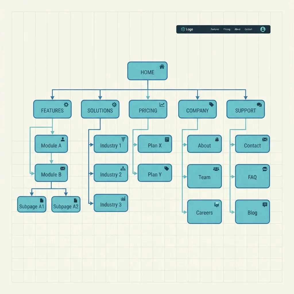
Information architecture (IA) is the structure that determines where things live and how users move between them. For applications, the IA is usually an app shell: a persistent primary navigation, a contextual secondary level, and a content area.
Practical rules we apply:
- Keep primary navigation to five to seven destinations. Beyond that, group items.
- Name items after user goals, not internal modules. "Invoices" beats "Billing Engine."
- Make the current location obvious with an active state and a breadcrumb for nested records.
- Reserve a global search or command palette when the app holds more than a few hundred records.
Validate the IA with a tree test before visual design. Give ten users a task and ask where they would click in a text-only menu structure. If fewer than eight succeed, restructure. This test takes an hour and saves weeks.
Step 4: Wireframe the Primary Flows, Not Every Screen
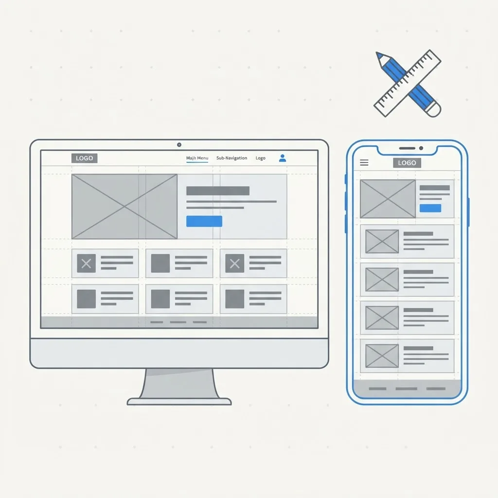
Wireframe the three ranked tasks end to end, including the boring middle steps. A flow is complete only when you have designed what happens on success, on failure, and on cancel.
Use low fidelity deliberately. Grey boxes keep the conversation about hierarchy and sequence rather than colors. Annotate each wireframe with the question it answers: "Where does the user confirm the amount?" "How do they undo this?"
A useful test at this stage is the squint test. Blur the screen. The most important element should still dominate. If three elements compete, your hierarchy is not resolved.
Step 5: Create a Design System, Not Screens
Applications grow. If you design screen by screen, you will produce twelve button variants and inconsistent spacing within a quarter. Instead, define a system.
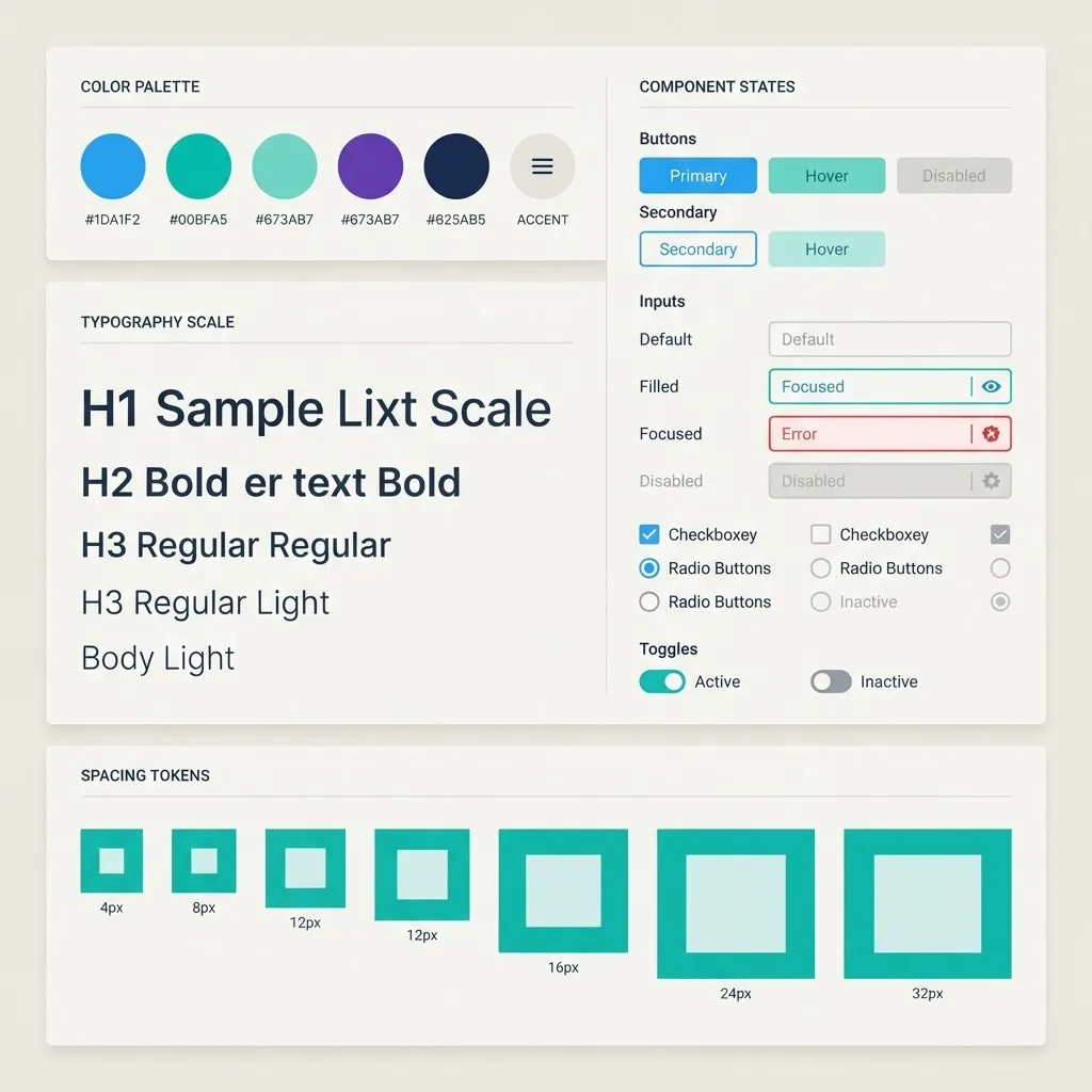
Your minimum viable design system includes:
- Color tokens: background, foreground, primary, muted, border, destructive, plus success and warning. Three to five base colors is plenty.
- Type scale: two families maximum, with a defined scale and body line height between 1.4 and 1.6 for readability.
- Spacing scale: a consistent 4px or 8px based scale used everywhere.
- Component states: default, hover, focus, active, disabled, loading, error, for every interactive element.
- Layout rules: container widths, grid behavior, and breakpoint decisions.
Design mobile first even for internal tools. Google reports that mobile-friendliness is a ranking and usability factor across the web, and in our own client data a meaningful share of dashboard sessions come from phones or tablets used away from a desk. Teams that build strong systems early ship features faster, which is why we bake this into every engagement at ZoneTechify.
Design Every State, Especially the Ugly Ones
Most design files contain only the happy path. Production applications spend a surprising amount of time in other states. For each data-driven view, design:
- Empty state with a clear next action, not just "No data."
- Loading state using skeletons that match final layout to avoid layout shift.
- Partial state where some data loaded and some failed.
- Error state with a plain-language cause and a recovery path.
- Permission state for users who cannot access the content.
Skipping these is the single most common reason a polished design looks broken after launch.
Step 6: Prototype and Test With Real Users
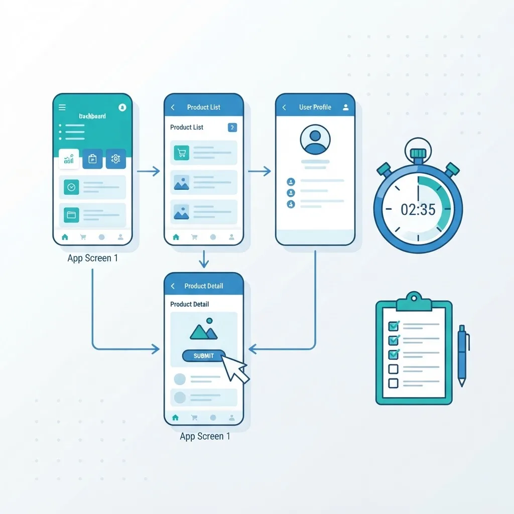
Build a clickable prototype of the primary flow and watch five people use it. Five is not a compromise; Nielsen Norman Group research found that testing with five users surfaces roughly 85 percent of usability problems, making repeated small tests more valuable than one large study.
Run the test properly:
- Give a task, not instructions. Say "Send an invoice to a new client," never "Click the Invoices tab."
- Stay silent while they struggle. The struggle is your data.
- Record time on task, number of wrong clicks, and where they hesitate.
- Fix the top two issues, then retest. Iteration beats perfection.
Step 7: Design for Performance and Accessibility From the Start
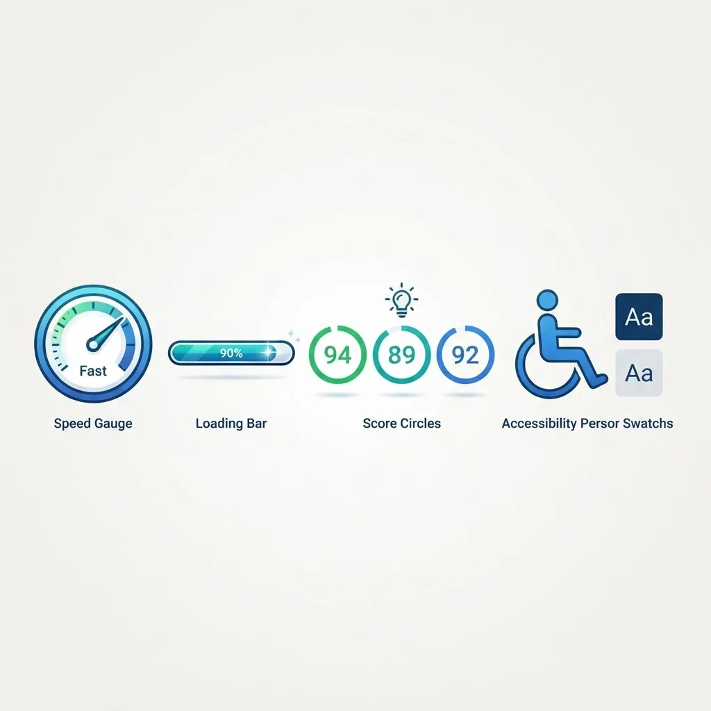
Performance is a design decision. According to Google, as pages get heavier the probability of abandonment climbs sharply, and Core Web Vitals thresholds recommend a Largest Contentful Paint under 2.5 seconds. Designs that require six web fonts, autoplaying media, and a hero image above every table make that target impossible.
Design choices that protect performance:
- Limit font families and weights to what the interface actually uses.
- Prefer virtualized or paginated tables over rendering thousands of rows.
- Specify image dimensions so layout does not shift as assets load.
- Design skeletons rather than full-page spinners so perceived speed improves.
Accessibility follows the same logic. Meet WCAG 2.2 AA contrast of 4.5:1 for body text, ensure every interactive element has a visible focus ring, label every form field, keep touch targets at least 44 by 44 pixels, and confirm the entire primary flow is completable with a keyboard alone. Accessible applications are also more usable for everyone, and they reduce legal exposure. Teams at WebPeak treat accessibility as an acceptance criterion rather than a final audit item.
Step 8: Hand Off Specifications Developers Can Actually Build
A design is finished when a developer can implement it without asking you a question. That means documenting more than pixels.
Include in your handoff:
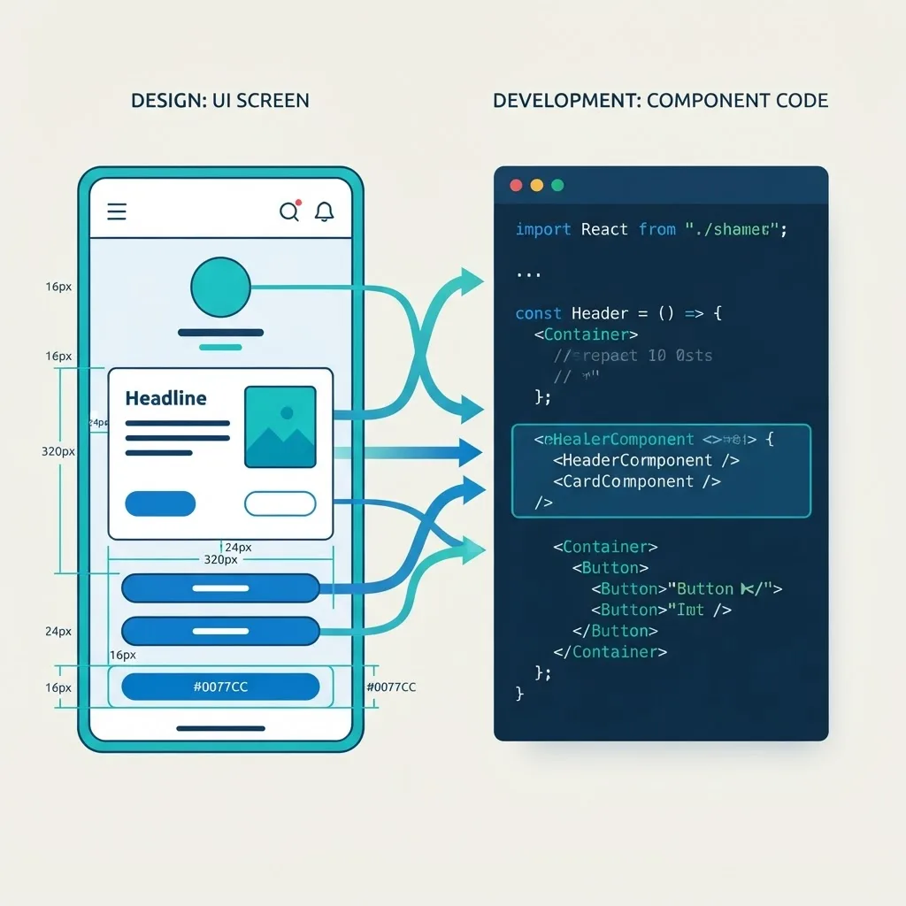
- Named tokens for color, spacing, radius, and typography that map to code variables.
- Component specs with every state and the rules for when each appears.
- Responsive behavior at each breakpoint, including what collapses or stacks.
- Interaction detail: validation timing, animation duration, focus movement after actions.
- Copy for errors, empty states, and confirmations. Placeholder text becomes shipped text.
Review the built interface against the spec before release, and log gaps as bugs. If your team needs design and engineering executed together, our web application development services cover the full path from IA to deployed product.
Common Web Application Design Mistakes to Avoid
- Designing dashboards before flows. Dashboards summarize work that must exist first.
- Hiding primary actions in overflow menus. Daily tasks deserve permanent buttons.
- Modal stacking. A modal opening a modal signals a missing page.
- Unlabeled icon-only navigation. Icons alone are ambiguous; add text labels.
- Destructive actions without confirmation or undo. Prefer undo over confirmation dialogs where technically possible.
- Tables with no sorting, filtering, or column control. Data views without controls are unusable at scale.
Key Takeaways
- Web applications are task tools, so design flows and states before visuals.
- Map data entities and permissions early; the interface is a view onto that model.
- Keep primary navigation to five to seven items and validate structure with a tree test.
- Testing with five users reveals roughly 85 percent of usability problems, per Nielsen Norman Group.
- Google's Core Web Vitals guidance recommends Largest Contentful Paint under 2.5 seconds, which design choices directly control.
- Meet WCAG 2.2 AA contrast of 4.5:1, keyboard operability, and visible focus states.
- Ship a token-based design system so the product stays consistent as it grows.
Frequently Asked Questions (FAQ)
How long does it take to design a web application?
A focused first version typically takes four to eight weeks: one to two weeks for discovery and information architecture, two weeks for wireframes and flows, two weeks for the design system and high fidelity screens, and one week for testing and handoff. Complex permissions or many user roles extend this timeline.
What tools do I need to design a web application?
You need a component-based design tool such as Figma for wireframes, systems, and prototypes, a whiteboard tool for flows and IA, and a contrast checker for accessibility. Add a session recording or testing tool once real users exist. Tooling matters far less than a documented, reusable component system.
Should I design mobile or desktop first for a web app?
Design mobile first, then enhance for desktop. Starting narrow forces you to rank content and remove non-essential elements, which produces a clearer desktop layout too. The exception is data-dense tools like spreadsheets or analytics tables, where you design the desktop table logic first and then decide what collapses on mobile.
What is the difference between UI and UX in web application design?
UX covers the structure and decisions: user research, flows, information architecture, and whether the task can be completed efficiently. UI covers the visible layer: layout, color, typography, components, and states. A beautiful UI on a broken UX still fails, because users abandon tasks they cannot finish confidently.
How do I know if my web application design is actually good?
Measure it. Track task completion rate, time on task, error and retry frequency, support tickets per feature, and week-four retention. Good design shows up as fewer support requests and faster task completion, not as subjective praise. Run a five-user usability test every release cycle to catch regressions early.
Do I need a design system for a small web application?
Yes, but keep it small. Even a five-screen application benefits from defined color tokens, one spacing scale, a type scale, and specified button and input states. That minimum takes about a day to define and prevents the inconsistency that makes later features slow and expensive to build.